

BRAND KEYWORDS
Adventurous, Warm, Natural, Enchanting
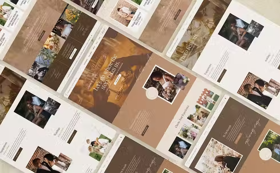
The Challenge
Hannah already had a logo for her business, but came to me without a fully-fleshed out branded identity in place. She needed a cohesive visual direction that could be applied to her website — one that emulated her rich, storytelling photography style. Her site needed to feel high-end yet grounded, artistic but not overly polished, and most importantly: like her.

BRAND PATTERN

My Approach
Using Hannah's existing logo as a foundation, I crafted a broader brand identity that could extend across the full website experience. I pulled in font pairings, color inspiration, and layout styles that complemented the logo and her portfolio of photography. “Adventurous” was the word she used to describe her vision and style — so every design choice, from layered textures to immersive page layouts, was guided by that one word.
← hover to preview
tap to preview ↓

project details
NOTES
Some of the collateral shown is conceptual, created to help the client visualize how their brand could come to life across various touchpoints, and may not have been produced in final form.
attribution
Produced for Client
CREDITS
Photography provided by Hannah Eng©
service provided
Hannah Eng Photo
BUSINESS TYPE: photographer
location: east tennessee
SERVICES RENDERED: Brand + Website duo
Hannah entrusted me to take the reins on a website project for her growing photography business and come up with something magical. The warm, organic design gave Hannah a digital home that tells her story and leaves a lasting impression on potential clients.