Joy of Dawn is a nonprofit organization supporting breast cancer patients in East Tennessee with short-term financial assistance during treatment. I designed a brand identity and responsive website to help the foundation connect with and support those in need.


BRAND KEYWORDS
Approachable, Friendly, Courageous, Spirited

The Challenge
Hannah already had a logo for her business, but came to me without a fully-fleshed out branded identity in place. She needed a cohesive visual direction that could be applied to her website — one that emulated her rich, storytelling photography style. Her site needed to feel high-end yet grounded, artistic but not overly polished, and most importantly: like her.

BRAND PATTERN


My Approach
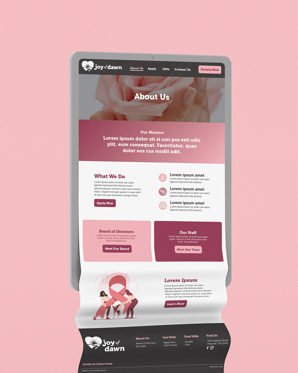
I paired soft pink and rich burgundy hues—conveying compassion and strength—with friendly, accessible typefaces to make the organization’s message welcoming, cordial, and easy to digest. A clean, concise page layout was top-of-mind, ensuring that users already navigating a difficult time could find the information and resources they needed as simply as possible.
← hover to preview
tap to preview ↓


the results
With an uncomplicated user experience and thoughtful visual language, the organization connects more effectively with both breast cancer patients and donors. With a cohesive, polished brand, they approach events and outreach opportunities with confidence, knowing they are fully prepared to make an impact.
project credits
NOTES
Some of the collateral shown is conceptual, created to help the client visualize how their brand could come to life across various touchpoints, and may not have been produced in final form.
attribution
Produced for Visual Voice©
CREDITS
Copywriting by Visual Voice©
service provided